
Create a Reusable Text Input With React Hook Form
Deploy your React and Node app in seconds, with no infrastructure to manage. Qoddi App Platform is free for developers! Create an account today.
Sometimes, managing several input fields gets crazy complex. You may need to recreate the same thing for each form and that’s can be really time-consuming.
With a reusable Text Input in React, you can create just one input element in just one component and reuse it everywhere in any form. Let’s do this.
Prerequisites
- Understanding of React and how forms work in React
- A free Qoddi.com account to deploy your code
React form Handle
You must have seen this code:
//The useState Hook
const [textValue, textValueSet] = useState(‘’)

//onChange Handler
const handleForm = (event)=>{
	textValueSet(event.target.value)
}

return(
	//input field
<input type=”text” name=”textField” onChange={handleForm} value={textValue} >
 )
First, we create a useState hook to store input value. Next, we set the input field value to the useState hook.
Then, in the input form a onChange handler sets the typed text to useState hook.
React Hook Form
React Hook form is a great library to handle forms. Install it with:
npm i react-hook-form Import react-hook-form at the top of your code:
import {useForm} from ‘react-hook-form
In your App component, call and destruct useForm like this:
const App = ()=>{
	const {register} = useForm()
}
Now, use register in your component’s return statement:
return(
	//input field
<input {...register(‘textField’)}>
 )
No need to have any more extra data there. Super cool, huh!
Inside the register call, the argument is the name of the input name. React hook form will build everything with this one single data.
You can add extra features. Ex - to make a required field, you need to do this:
return(
	//input field
<input {...register(‘textField’, {required: true})}>
 )
Let’s add a placeholder, max, and min length:
return(
	//input field
<input placeholder=”Text Field” {...register(‘textField’, {required: true, maxLength: 20, minLength: 2})}>

 )
Error Handling
To handle errors, we use the useFormState custom hooks from React Hook Form. formState subscribes to different form states of the plugin. We can subscribe to errors state like this:
const {register, formState : {errors} } = useForm()
Let’s fill our input with error messages:
return(
	//input field
<div className=”form-field”>
<input placeholder=”Text Field” {...register(‘textField’, {
required: {
value: true,
message: “This is required”
},
maxLength: {
value: 20,
message: “Value must be maximum 20”
},
minLength: {
value: 2,
message: “Value must be minimum 2”
},
})}>
<p>{
//If error exists in the textField
errors.[textField] && errors[textField].message
}</p>
</div>


 )
First, we added value and message property to our validators. Error state checks for the value and message property, if the value doesn’t match it shows an error message.
Then we show the error message under the input field. It will show only if any error exists for the field name.
Reusable Input Component
To create an error message, let's create a TextInput.js component.
Each time this component gets used in a form, it may have different maxLength, minLength, message, required property value.
So, we will let the component receive some props - fieldName (name of the input field), errors from the useForm, placeHolder, isRequired, maximLength and minimLength:
const TextInput = ({fieldName, register, errors, placeHolder, isRequired, maximLength, minimLength })=>{
	return(
	//input field

<div className=”field-name”>
<input placeholder= {placeHolder} {...register(fieldName, {
required: {
value: isRequired,
message: “This is required”
},
maxLength: {
value: maximLength,
message: `Value must be maximum ${maximLength}`
},
minLength: {
value: minimLength,
message: `Value must be minimum ${minimLength}`
},
})}>

<p>{
//If error exists in the textField
errors[fieldName] && errors[fieldName].message}</p>
<div>

 )
}
Now, we can import this component and use it in our APP component. Let’s implement this.
Implement, Design, and Deploy
First, let’s create a NextJS React server. Open a folder and open a terminal window. Run:
npx create-next-app ./ -y
npm i react-hook-form@latest
code .
In your code editor, remove everything from index.js
//Import files in App.js
import Head from "next/head";
import styles from "../styles/Home.module.css";
import { useForm } from "react-hook-form";
import TextInput from "../utils/TextInput";

//Define App here
export default function App() {
//destruct useForm of react hook form
const { register, handleSubmit, formState: { errors }, } = useForm();

//This runs on submit
const onSubmit = (data) => {
console.log(data);
};

//returns the App component
return (
	//Form element
<form onSubmit={handleSubmit(onSubmit)}>

	{//Write TextInput component here and give value to all props
}
<TextInput
fieldName="textField"
register={register}
errors={errors}
placeHolder="Text Field"
isRequired={true}
maximLength={20}
minimLength={2}
/>

	//Submit the form
<input type="submit" value="Submit to Console" />
</form>
);
 }
Create a utils folder in your root project directory and create a TextInput.js in it. Paste this code in this file:
const TextInput = (
{ fieldName, register, errors, placeHolder, isRequired, maximLength, minimLength }
) => {

return (

//Input field
<div className="form-field">
<input
placeholder={placeHolder} {...register(fieldName, {
required: {
value: isRequired,
message: "This is required",
},
maxLength: {
value: maximLength,
message: `Value must be maximum ${maximLength}`,
},
minLength: {
value: minimLength,
message: `Value must be minimum ${minimLength}`,
},
}
)}
/>

<p> {

//Shows if error exist
errors[fieldName] && errors[fieldName].message

} </p>
</div> );
};

export default TextInput;
Now, build the code and check the input field and its error handling.
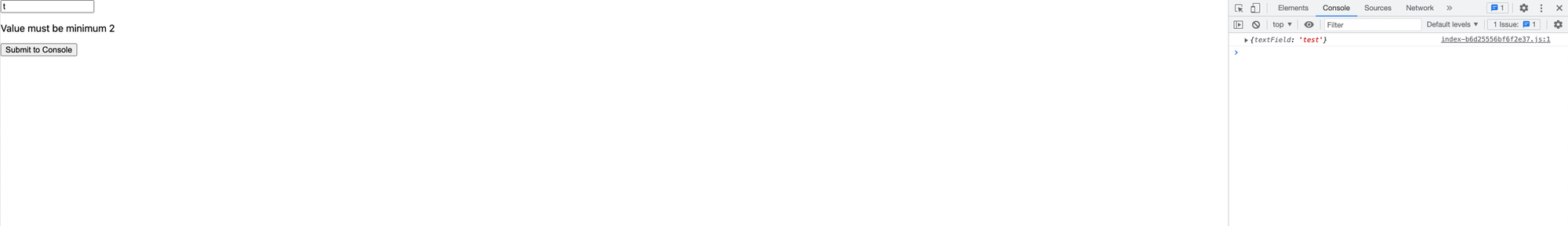
We quickly created a reusable Text Input we can use anywhere we want inside our React.JS app.
The easiest way to deploy your code on a live platform is with Qoddi.com: Qoddi is free for developers and can scale indefinitely for production apps!


